
Testing form
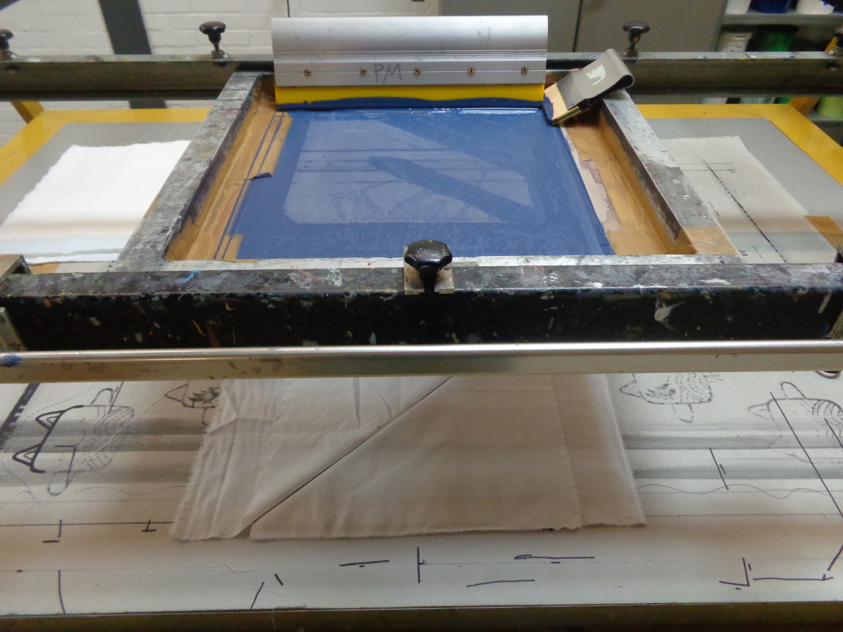
to Aliki van der Kruijs’ windowThe screen is ready for printing.
The silk screen is spanned with mesh type 48T, which is quite coarse. This type of mesh is used to print upon dark surfaces and to transfer a solid density. Because I use very graphic and open forms, I need to do some tests in order to feel how the ink ‘flows’ through the screen and in which angle the squeegee (tool to press ink through the mesh) works the best. For the tests I used a small screen with a comparable mesh, and waste ink in several colours that were available in the workshop. Good for now, because I did not make a colour decision yet.
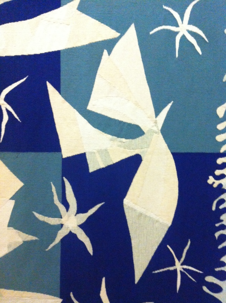
I saw this detail of a carpet made by Henri Matisse, where the white bird is build up out of many shapes in different shades of white. This makes me think of composing one form out of different parts.
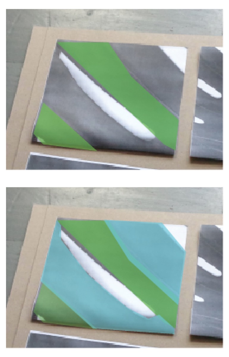
The big leaves on the screen will become very bold when I’ll only work with one colour. My idea is to compose the squares out of several layers to get an overlap in colour, and to create depth. I hope that the overlapping parts could mimic the veins in the original plant.
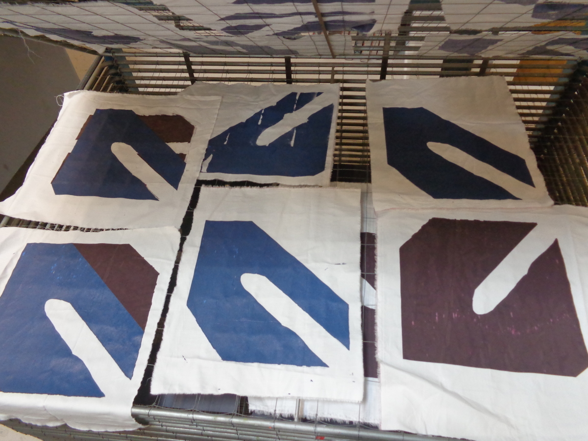
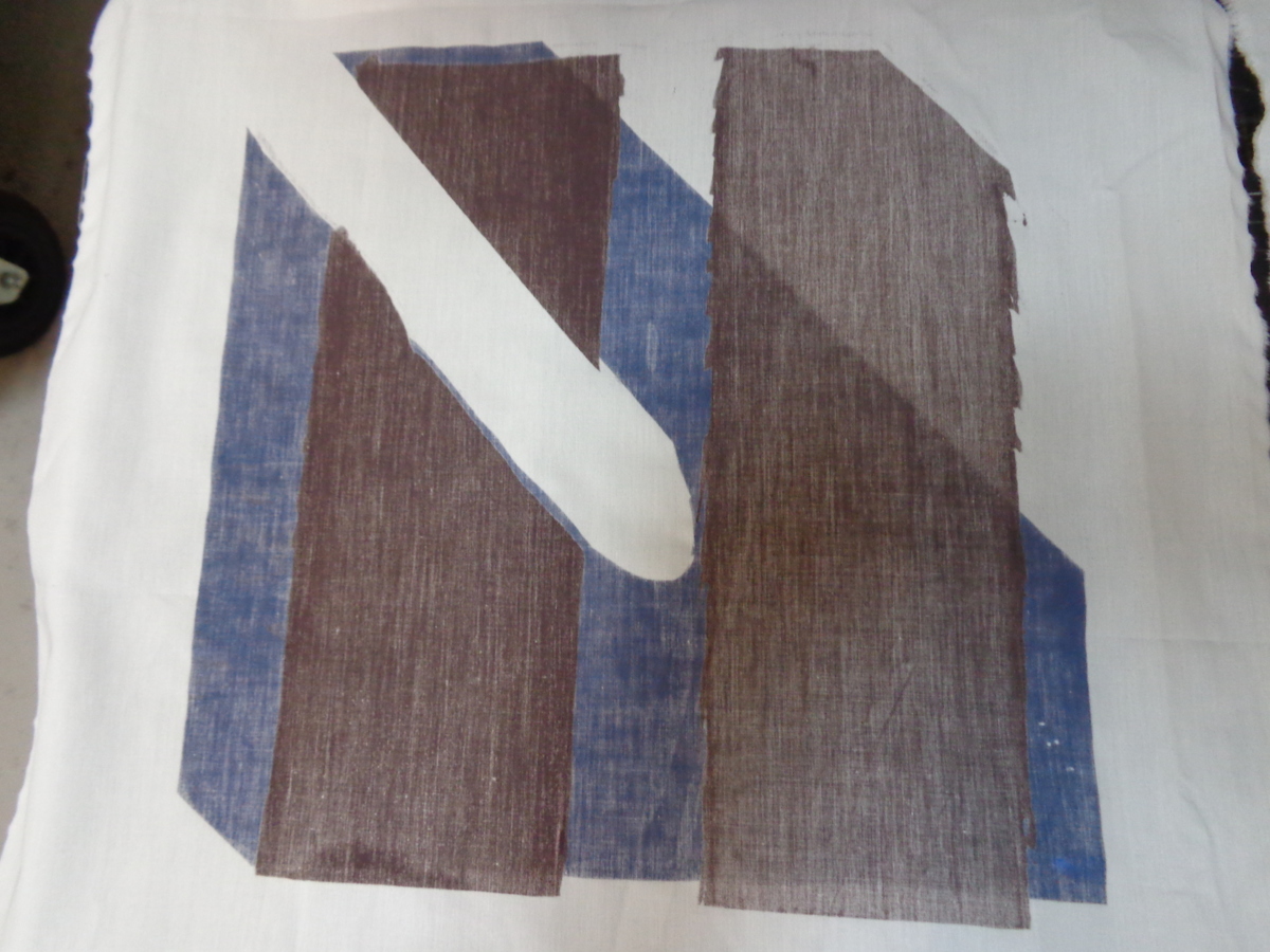
Some results of tests that weren’t satisfying at all.
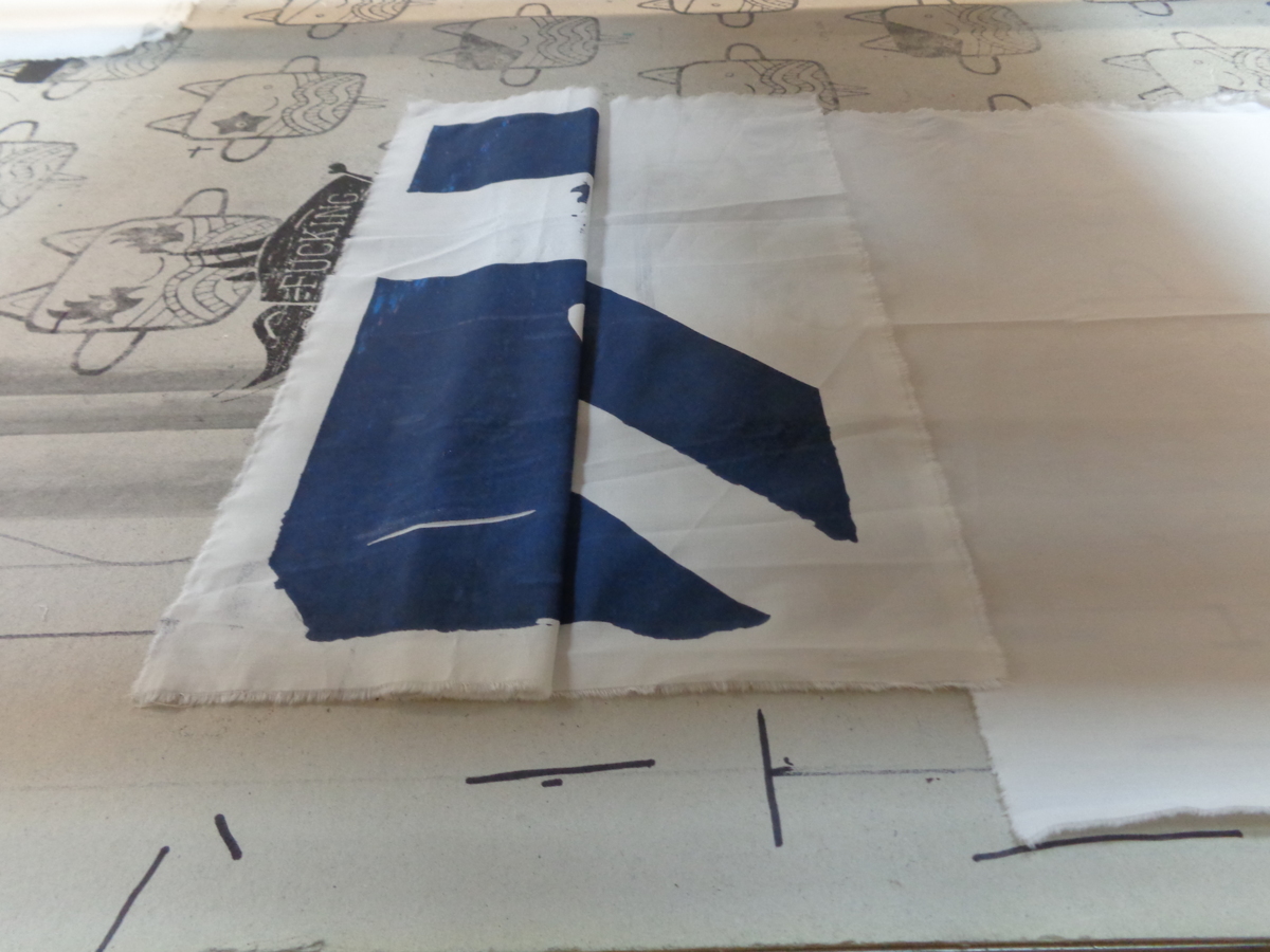
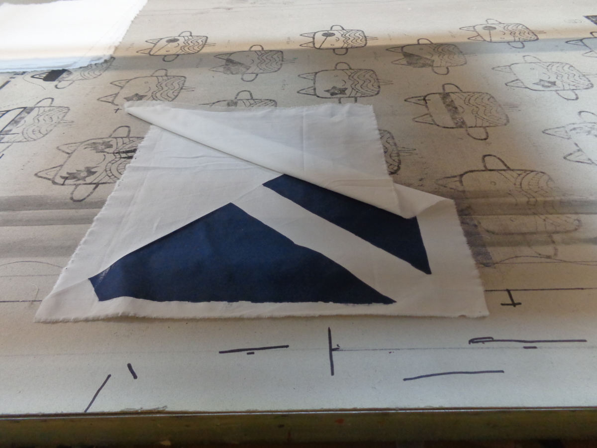
To eventually deconstruct the big leaf shape, I folded the textile before printing.
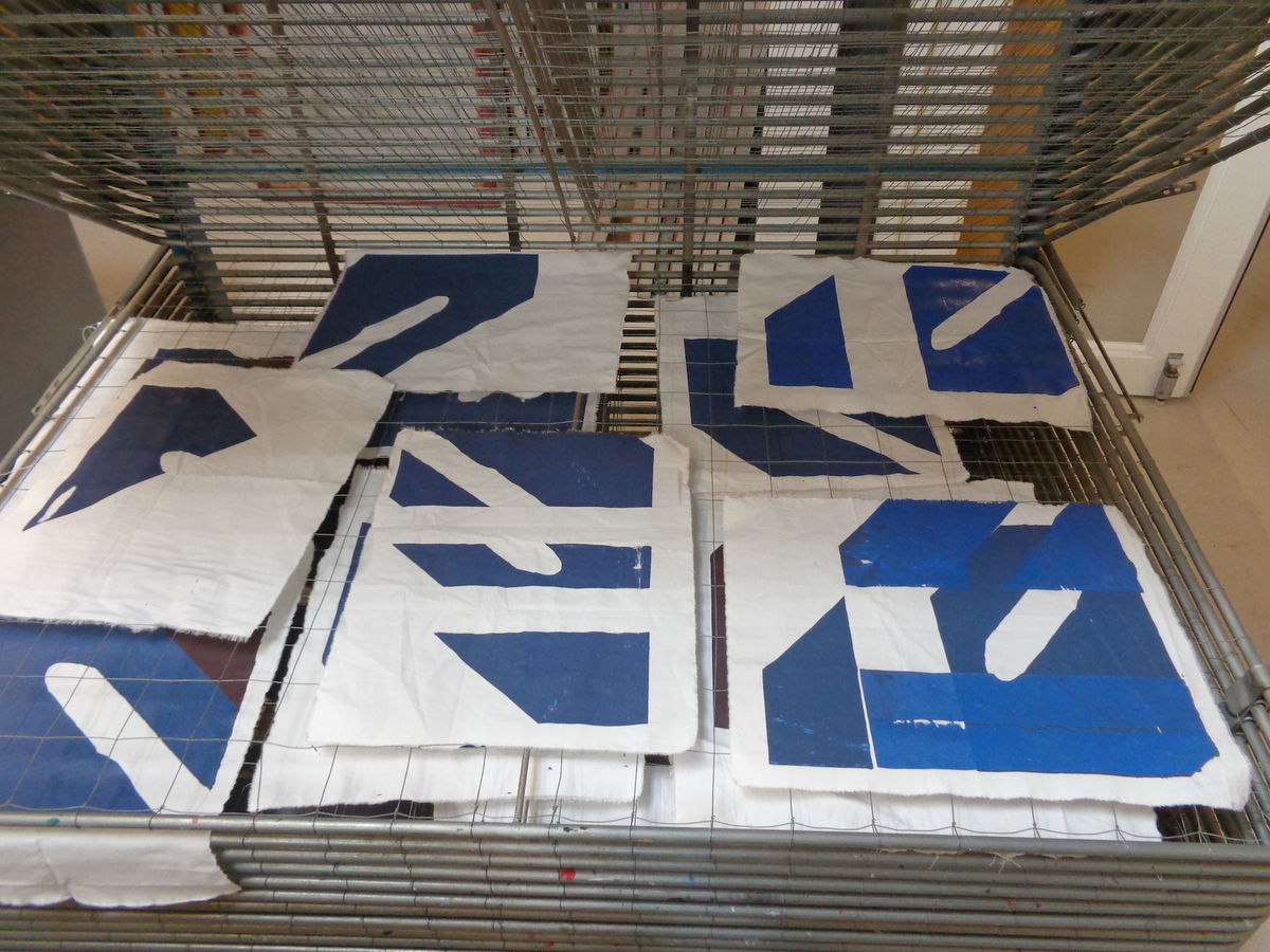
Some compositions after folding
The back of the fabric becomes more interesting than the front, but still this isn’t the ‘natural’ feeling I am looking for.
My aim is to develop a print that arises in a more natural way, and to work playfully within the set framework of the assignment. Folding could be a possibility for this. To be continued!