Some Logic + Black Rainbow
New Window × Rop van Mierlo
Some Logic and Black Rainbow are for sale in our shop.Rop van Mierlo (1980) is a graphic designer and illustrator, known for his colourful and cheerful paintings of animals and his use of the wet-on-wet painting technique. At the Dutch Design Week (18-26 October 2014) in Eindhoven, Rop will present Black Rainbow – a new work made exclusively for New Window in an edition of 49 – together with his previous project entitled Some Logic.
You told me earlier: "I'm a graphic designer who actually draws and paints more than he designs, so maybe I'm less of a graphic designer and more of an illustrator." How did that come to be?
I grew up in Eindhoven and all my life I've been drawing a lot. When I was young I used to reproduce a lot of other people's drawings. I drew a lot of images from my Disney and Asterix & Obelix books. It was my childhood dream to work at Walt Disney Studios and be able to work on an animation. There was also a lot of attention for drawing and painting at my Steiner education primary school. Later on I got interested in graffiti. What I found particularly interesting about that was that it enabled me to question authority and that I could—anonymously—show something of myself. I didn't really know what to do with the whole macho hip-hop side of the scene. And graffiti as I knew it was really focused on form, but just a few letters and nothing but form were of little interest to me.
Initially I went to the Sint Lucas Lyceum for graphic education in Boxtel. Afterwards I was admitted to the graphic design department at the Willem de Kooning Academie in Rotterdam. I didn't really bring out the best of myself at the Willem de Kooning: There was quite a relaxed atmosphere and I wasn't challenged enough. Back then I still lived in Eindhoven and had to travel to Rotterdam and back every day. I always thought that the people at the Design Academy Eindhoven were all product designers, but I then found out that there also was a very broad communication department, with graphic design, illustration and animation. I decided to switch to the Design Academy where I graduated cum laude in 2008 at the department Man and Communication.
Rop’s wet-on-wet painting from primary school
You're best known for your drawings that you make with a wet-on-wet technique. How did you discover this technique?
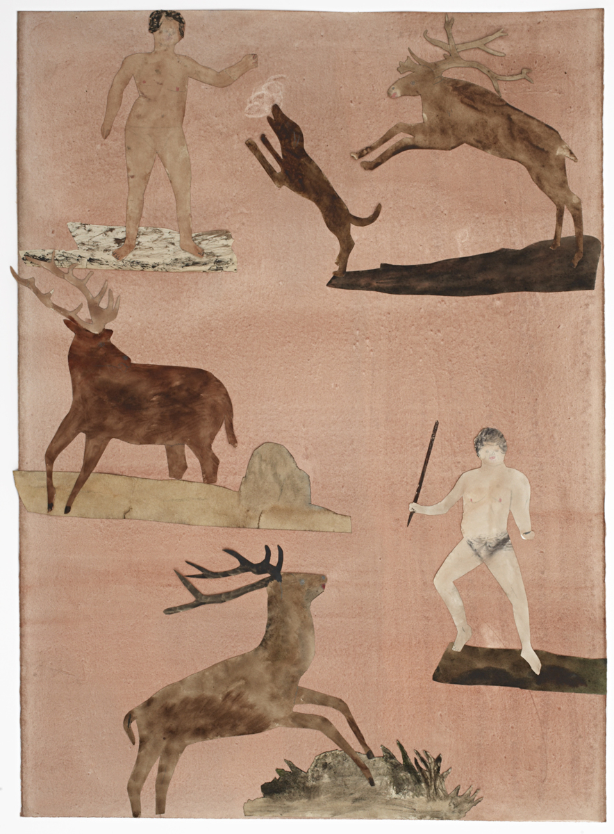
When I was young we were taught wet-on-wet painting at primary school, a technique that I used to hate back then. When I was graduating I was working on a project I called Bonsai & Poodles, a book about the human need to catch, tame, and control nature. As an illustrator you try to catch the world around you in lines, but I wanted to draw animals that I couldn't control. We humans have pets—I had a rabbit. It's actually such a weird idea that you take an animal out of its natural habitat and put it in a cage, where it is supposed to live out the rest of its life. It's not my intention to judge, but I think it's interesting that we humans feel the urge to do things like that. Throughout history people also used animals as symbols for their own qualities, "strength" for instance. Stick a picture of a tiger on your jacket, because you're a tough guy. But it's a tiger that's trapped in lines—It's cultivated nature. With my graduation project I wanted to free these trapped animals, to let them roam free in my drawings. I thought back to my childhood and remembered that wet-on-wet technique. That is how my wild animals came into existence.
What's the first step you take when you begin working on something new?
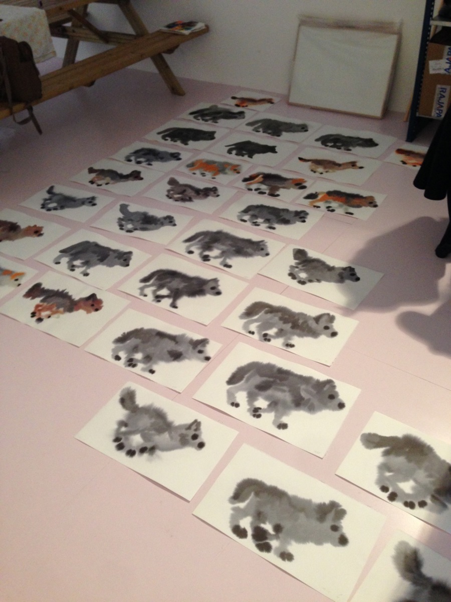
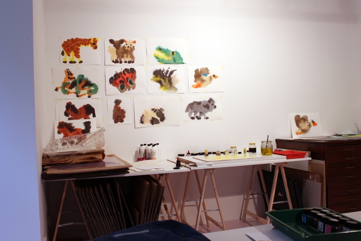
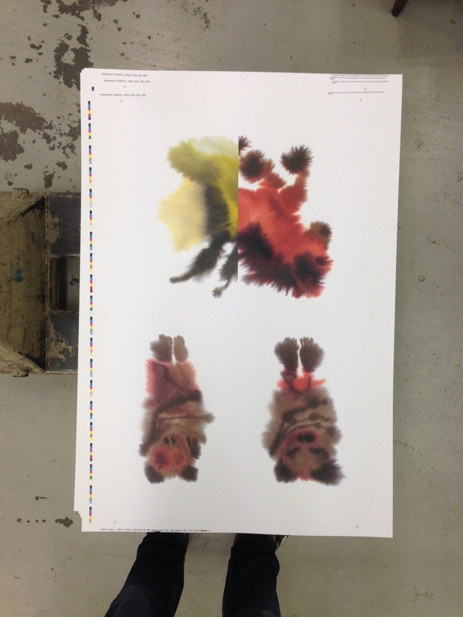
I spend a lot of time on gathering examples, like photographs, of the animal that I want to paint. I find photos in library books, but I mainly search for my source material online. The next step is to draw the animal in different postures and I decide which one seems best suited to continue working with. After I decide on the colours I start painting. I make many versions of each animal I paint: between four to sixty per animal (I paint multiple versions to take away the pressure that I have to do it perfectly on the first try). Eventually I choose the drawing that I think was most successful.
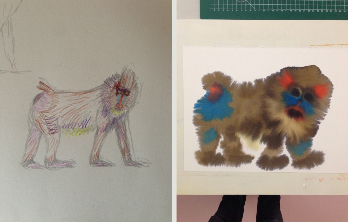
Your first sketches are quite figurative, whereas the end result looks a lot more abstract. What happens in between?
Uncertainty is usually quite a big factor in my work. Even though I make the drawing, I'm not fully in control of the end result. What I like a lot about the wet-on-wet technique is that I put a lot of effort into something that I'm not sure it pays off to try really hard on. During the painting I focus on the animal that I have in front of me as a sketch and I try to draw it as exact as possible—I don't try to react to the bleeding of the paint. It's interesting to think about what part of the painting is mine and what part is contributed by the technique I applied. In a way I just set the process in motion, with a drawing or painting as a starting point.
Even though I never really know what's going to happen, I do have certain expectations about the final result. I make a certain estimation in my mind of what is going to happen, but I'll never know for sure. Often the result somewhat corresponds, but usually I end up having to adjust the idea in my head. I want to have control, but a big part of the final result is up to the unexpected.
Can you name some artists or designers that you feel inspired by?
It's always artists and designers that pull off making work that they can fully get behind, regardless of what anyone else might think of it. They're driven out of a personal necessity, because they believe that not everything has been done before. What I also find fascinating is artists, designers, or actually, people in general, that keep on making relevant work throughout a longer period in their lives. For some people the amount of time that you're relevant in your field seems rather limited, but for others absolutely not. Perhaps that's what separates the men from the boys.
Masanao Hirayama
Jockum Nordström
How did Some Logic come about?
After finishing my book Wild Animals I wanted to investigate the wet-on-wet technique further and make another book along the same lines. With Wild Animals the focus was on the technique of painting and its uncontrolled nature. In Some Logic I tried to make a book that logically doesn't make sense, but has the feel that it does. At first I thought I'd make a book about insects. I started to take pictures of insects in the period from the 8th of August until the 22nd of October 2012. I left it up to chance what insects I would 'catch' with my camera in that period to determine which insects would be in the book. But I didn't have a good feeling about it anymore and the project hit a wall. I didn't like the fact that I had already completely thought out what the book was going to look like: There was no fun in that. That's when I turned the project around and started working much more intuitive.
I selected some animals from different ideas for other projects that I had and I started making sketches. I designed a book around these sketches and before long I had a sketch for a complete book, including title and theme. I started to work out the animals and bit by bit I expanded the book, added ideas and animals, and crossed some off the list. Just as in the first book I found it important that the selection of animals was somewhat random. It's a group of animals from all over the world, in all different colours and sizes. It was important that it intuitively made sense, but that there wasn't a very logical system of selection.
While working on Some Logic I asked the people around me for a lot of feedback—more than I did on previous projects and at a much earlier stage. This resulted in a lot of doubting if certain choices I wanted to make were the right ones. It's a difficult process anyway because it was the followup to a reasonably successful first book. That subconsciously puts a lot of pressure on you.
Some Logic at the printer
On the title page of your book it says "Japan is a great country"—something completely different than the title. Is that a motto for your book?
I once read an article about Japanese designers and why we westerners have difficulty understanding them. We work with a grid system that we 'have' to stick to. If for instance we choose to outline text in a book left, we will consistently do so. We're incredibly rigid in that sense. The Japanese can also be rigid like that, but when they half way through decide to defer from the rules, they just do it. For them design is more about intuition, about what makes sense to them at that moment. This idea fits the direction I wanted to take this book perfectly, so I wanted to make a reference to Japan somewhere in the book.
Furthermore it surprises me that in general, and especially in children's books, the title is often repeated three or four times before the book actually starts, and I wanted play with that by adding another title besides Some Logic. Also interesting is that kids don't really mind these things, but adults always have to find a sort of logical connection.
The text on the back was written by Jan Willem Sterenborg. He also wrote the text on the bookmarker for my first book and he beautifully captured in words what my intention is.
Inspiration for the bookmarker
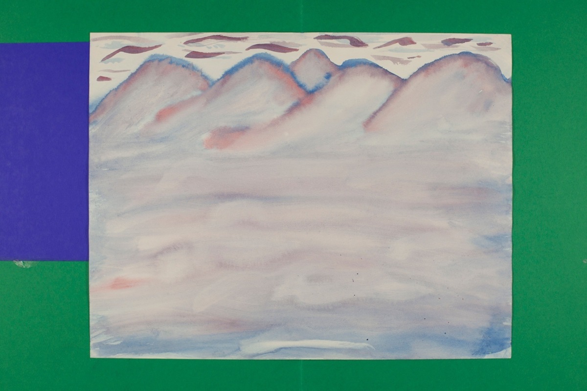
And in the middle of Some Logic we suddenly find a spread with two completely yellow pages, titled Sunshine. Is this also a reference to Japan?
That wasn't the initial intention, but it could very well refer to Japan as the land of the rising sun. I also wanted to see if I could add something that wasn't an animal but that would fit the book as a whole without feeling misplaced.
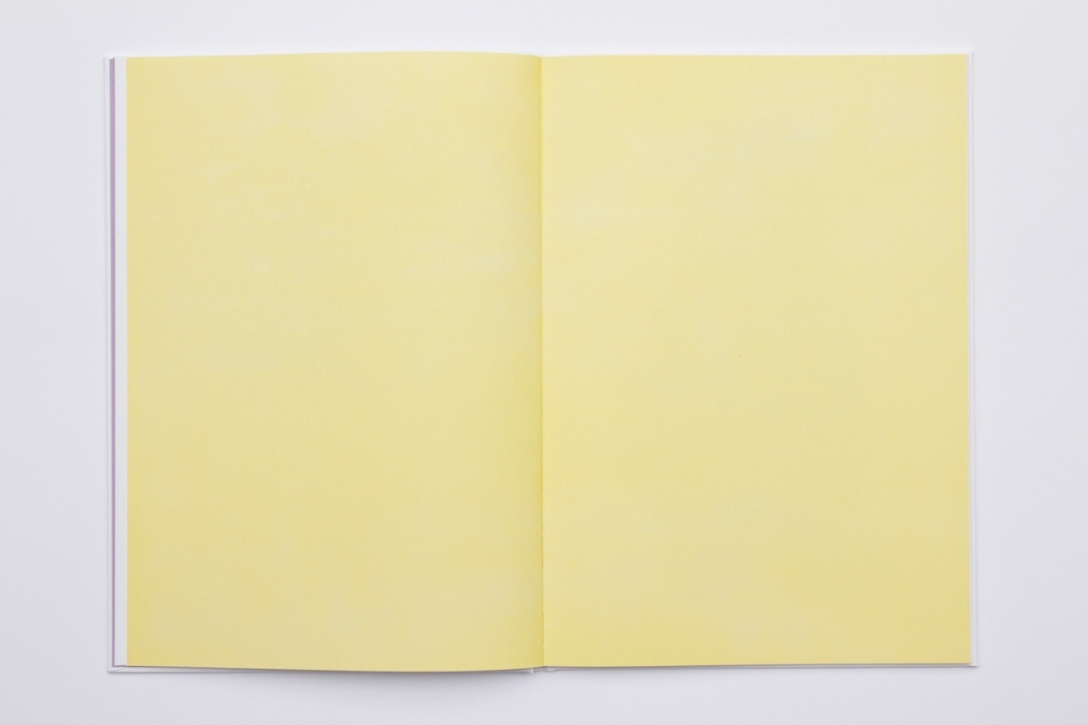
Sunshine spread from ‘Some Logic’
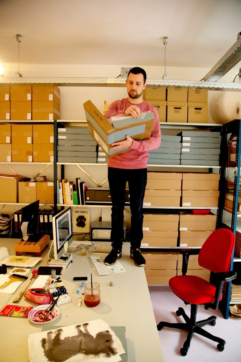
During the Dutch Design Week 2014 you will show your Some Logic project, and its process, in your offline window (cabinet). Initially you finished this project independently earlier this year.
I'm glad you also made something especially for New Window. You're going to show a composition of animals from Some Logic in your cabinet, a sort of vibrant collage. I thought it would be nice if you would make something that would fit as an addition to the book, but not another animal. Can you tell us something about what you ended up making?
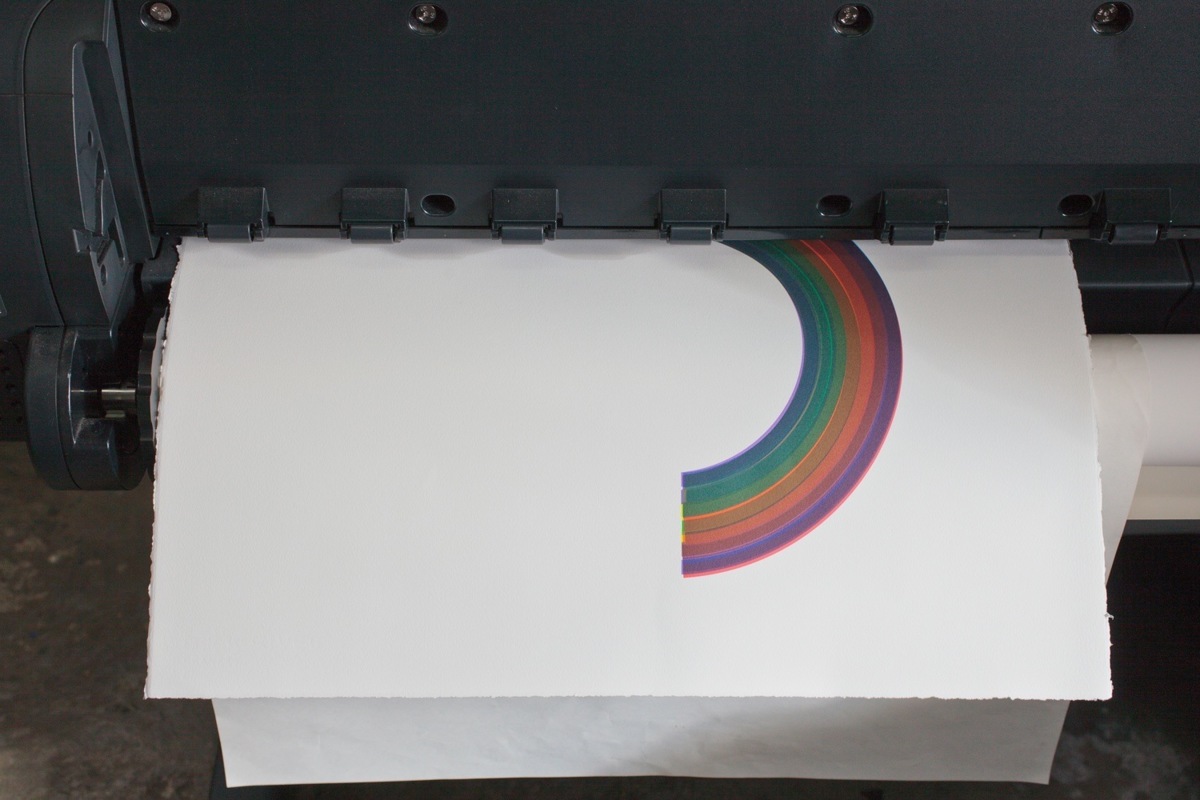
New Window asked me to make a print that was connected to the book, but could also stand on its own. I’ve made a black rainbow that, just like the yellow pages of Sunshine, is an enrichment of the animal world of Some Logic. In my first book Bonsai & Poodles I already made rainbows and for New Window I got the opportunity to publish one as a print, which was something I wanted to do for a long time. Some Logic and http://shop.newwindow.nl/product/black-rainbow image: Black Rainbow do and don't belong together at the same time. While being very different from each other in terms of the techniques I used, they have a strong connection, which creates an interesting tension between the two. In my books I try to let the animals free, whereas for Black Rainbow I tried to do the opposite: I wanted to 'catch' a rainbow, tame it and manipulate it, make it my own.
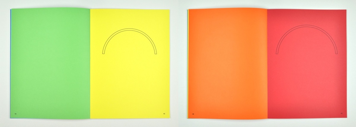
Rainbow spreads from Bonsai & Poodles
I also reinterpreted the rainbow in terms of colour. Exclusively for New Window I make an archival pigment print of a black rainbow in an edition of 49. It is a completely different technique than the wet-on-wet painting. Archival pigment printing is a technique that uses a very high quality pigment. Pure pigments are used and that's why it's one of the most expensive means of reproduction. They'd keep their true colour for a hundred years with ease. With other printing techniques the image fades much quicker.
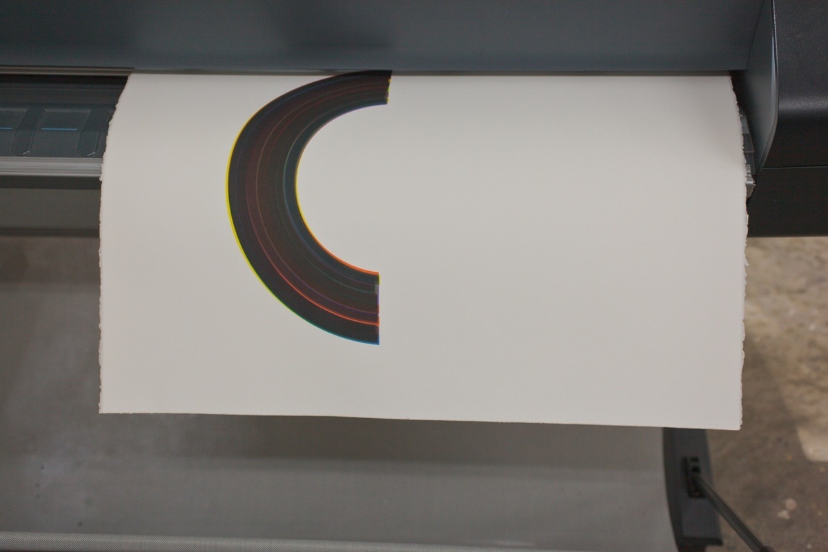
By printing all seven colours of the rainbow on top of each other in all possible different orders you end up with a black rainbow. Even though it's black, it's actually the most colourful rainbow that's out there—in print at least. This project also was a big challenge for the printer: seven colours in seven different print runs, so a total of 49 strokes of colour on one piece of paper.
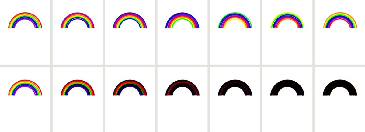
The top row represents the 7 separate layers. The second row shows these layers printed on top of each other.

Print run 4
Print run 6