Working structure
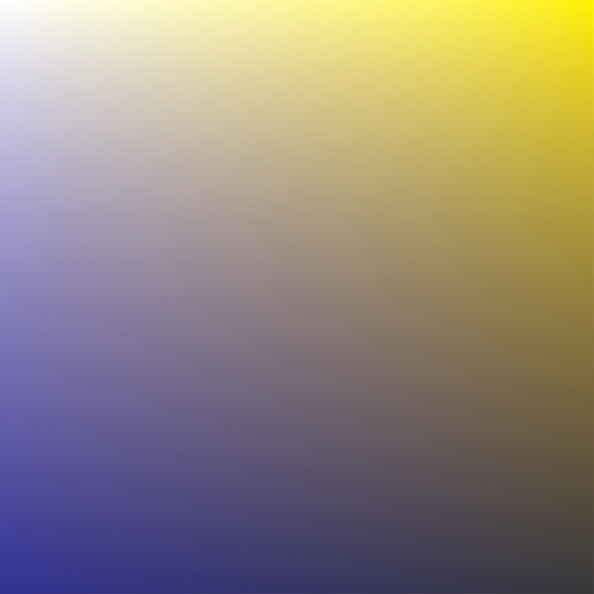
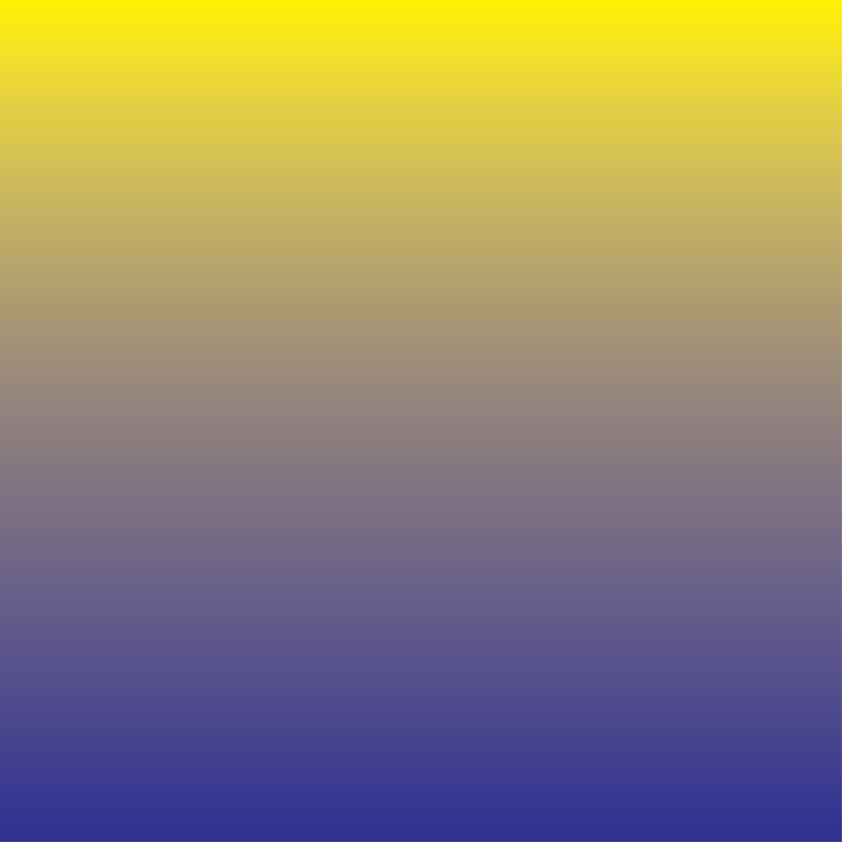
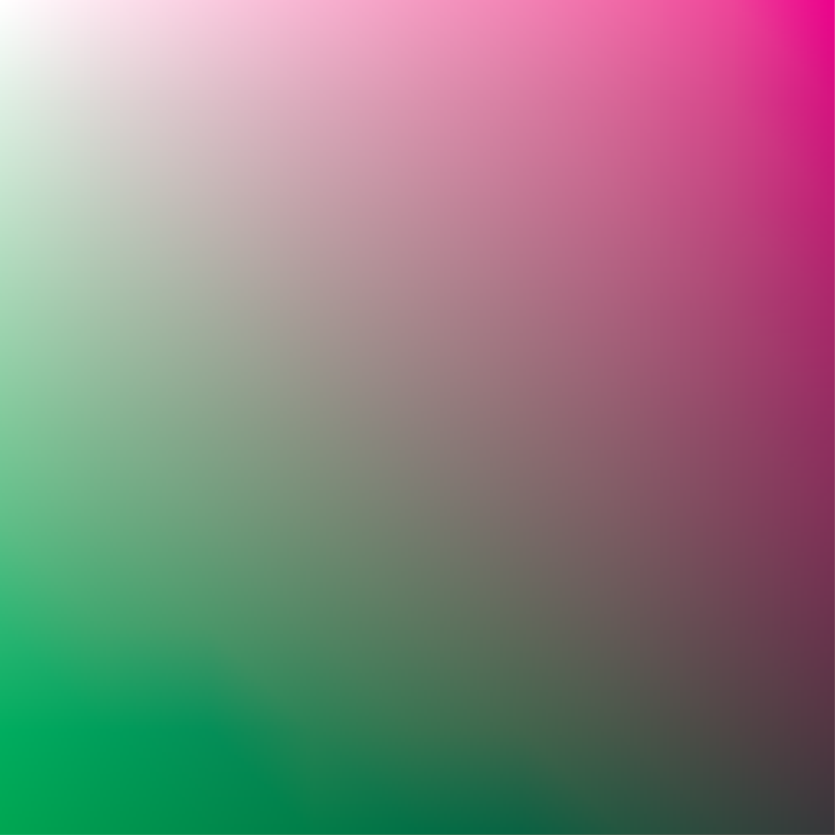
to Rogier Arents’ windowThis week I have worked on a composition which is inspired by close-ups of the gradient prints. The new composition will be combined with a systematical way of screen printing developed during my artist–in–residence at Grafisch Atelier Daglicht. I came up with the following working structure and composition:
1. Colour
I will use 3 colours: Cyan, Magenta and Yellow. Every single print will get one layer of every colour.
2. Rotation of paper
The paper can be rotated under the silk screen in steps of 90 degrees, hereby four positions are possible.
When the colours are printed, the papers will be systematically placed in the 4 varying positions. Using this structure 10 unique variations are possible.

3. Composition
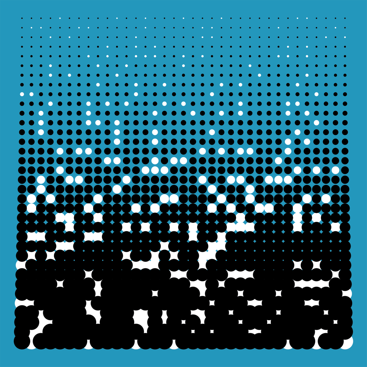
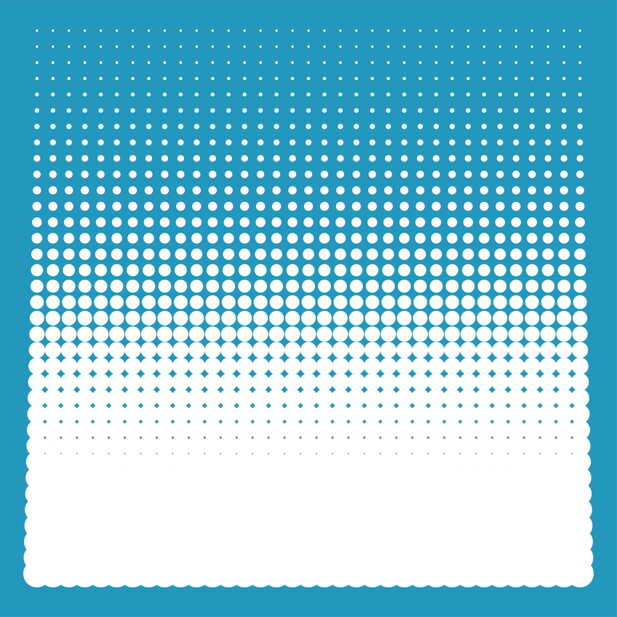
I have chosen to work with the following raster because of its roughness, its gradient and the overlap of the larger dots, which will create extra graphic details.
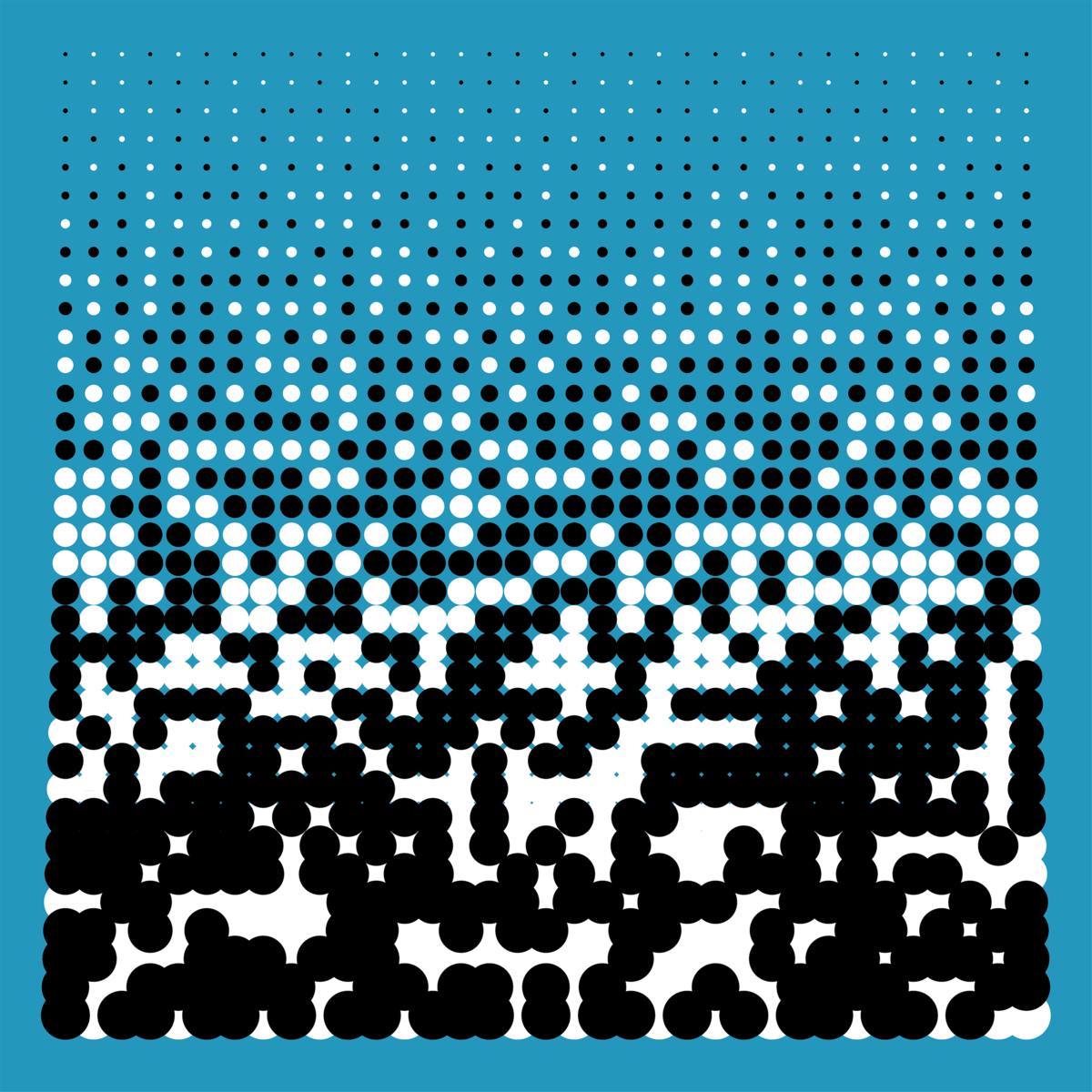
The raster will be applied as a sticker on the silk screen ( black). The screen will get a layer of light sensitive emulsion which will close all spaces between and around the stickers ( blue).
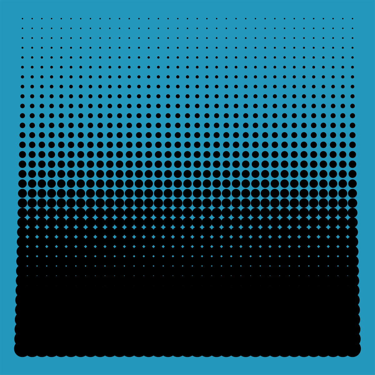
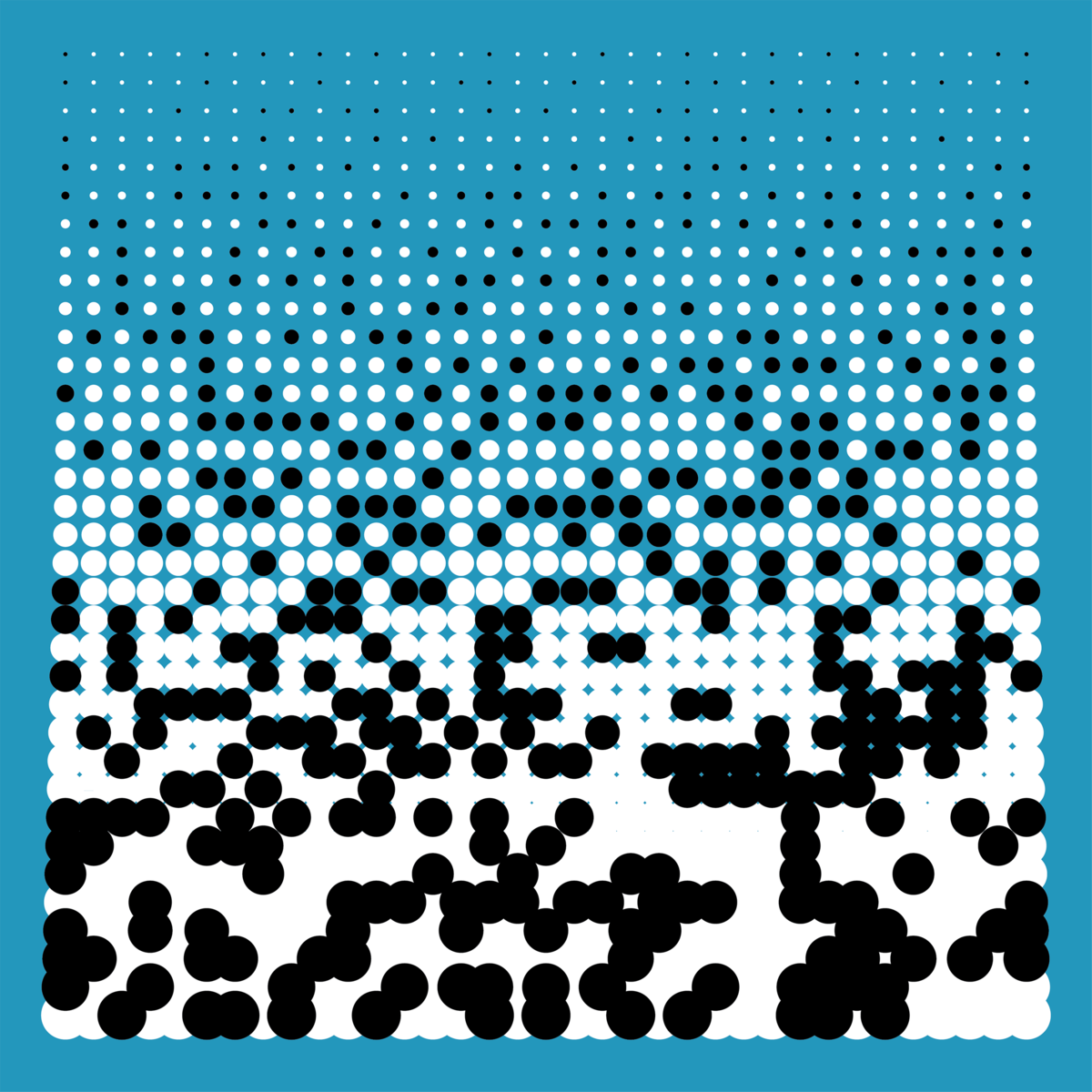
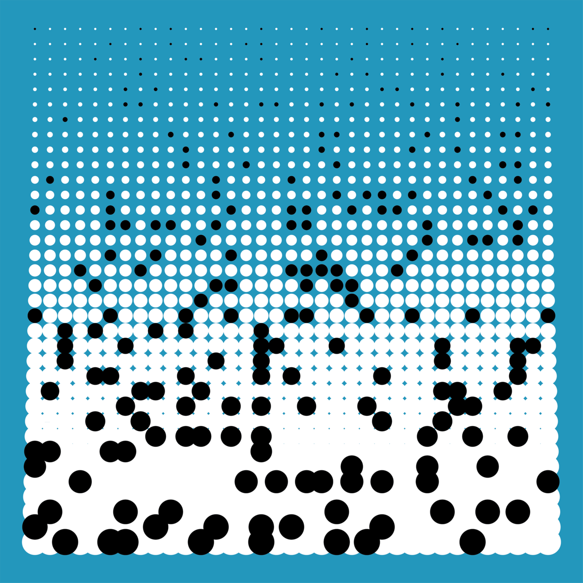
Before printing every next colour I will peel off more and more stickers from the silk screen, exposing more and more ink to the paper (* white). I will repeat this process 5 times till all the stickers are removed from the screen. This will result in 5 series of 10 prints and every print of this series will have a unique composition.
* referring to colours on the following scheme.
