42 × 1€
New Window × Simon Wald-Lasowski
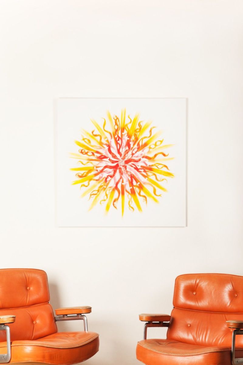
42 × 1€ is for sale in our shop.Simon Wald-Lasowski (Paris, FR, 1980) is a freelance photographer. He makes colourful, fun, twisted work by use of bricolage, word play, and 'cliché bending'. While lighthearted at first sight, his images often reveal a certain depth on second inspection.
Tell us a bit about who you are and what you're working on at the moment?
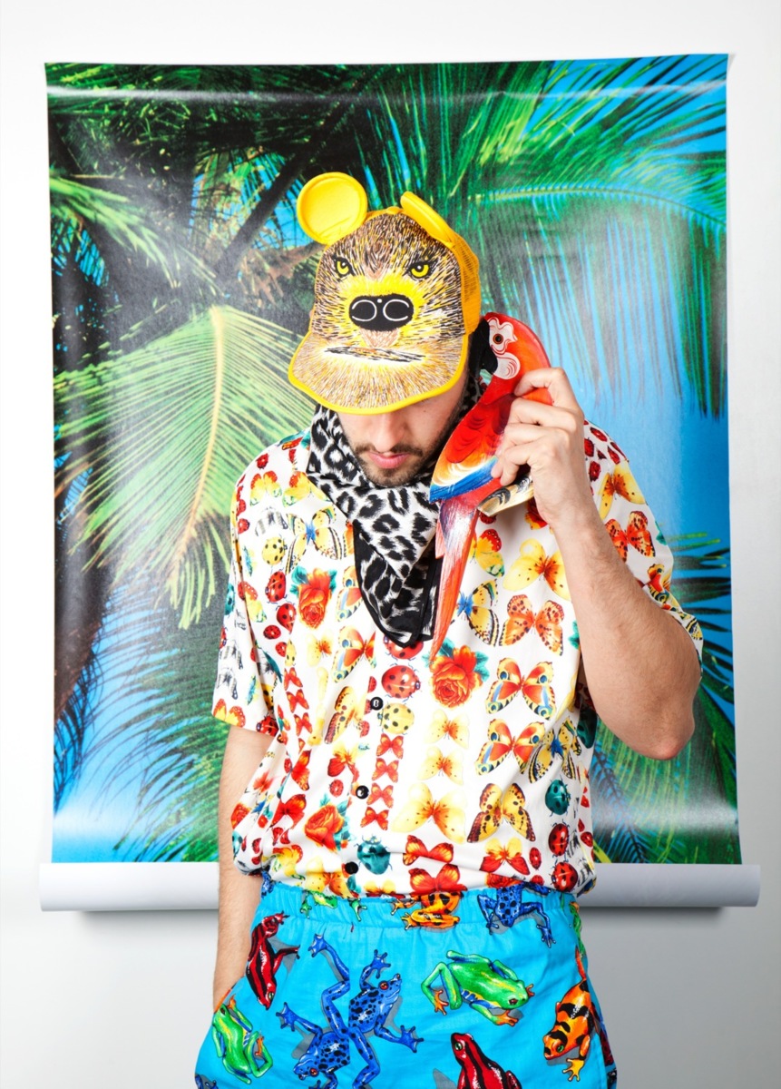
I live in Amsterdam and graduated from the Gerrit Rietveld Academie in 2004 as a graphic designer, without ever having designed any books. I’ve always been more of an image maker.
My approach is always very personal, and that personal approach blurs the boundaries between my autonomous and commissioned work. I'm always actively exploring those boundaries and try to exploit them. Recently I started teaching in the Graphic Design and Photography department of the Royal Academy of Art in The Hague, which I do with great pleasure. As often as I can I make music with my friend Sajoscha Talirz under the name Volcano Pork. I am proud to say that we make soundtracks for studio Moniker. We composed the music for this great user generated animation project called Your Line or Mine, currently exhibited in the Stedelijk Museum in Amsterdam.
Are you someone that conjures up the final result in their head before they start producing, or do you prefer a more methodical approach?
I usually ponder and stress and let things brew in my mind until that eureka moment. Therefore, my sketches are usually very minimal—it’s all happening in my head.
Do you work with specific themes or other elements by which a viewer can recognise a work as distinctly yours?
It’s maybe not up to me to analyse my own work. But there are definitely a few reoccurring aspects in my creations. Colours for example: colours enable me to strengthen my signature as a maker. Ideas are always the starting point of my images, but the love for certain colour combinations and use of these combinations in my work for years has naturally concluded in a 'copyright' on certain tints of pastels and on turquoise specifically. The fact that I also dress in pastels in my everyday life only strengthens this colour embodiment. Friends might see something on the street and say 'Hey, that's a Simon combination!' It's nice to know that in my personal and professional circle my 'palette' exists as an independent entity.
Apart from the obvious visual elements such as a strong and simple graphic approach I would say that it’s my playful mentality that ties my projects together, as varied as those may be. With simple means I try to twist the ‘boring daily reality’ in an absurd, playful and slightly provocative manner. My aim is to make people smile and question the way one sees the world, to open up new horizons.
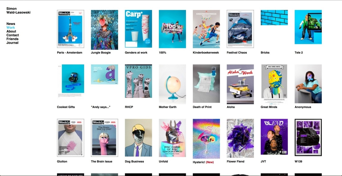
Screenshot of Simon's website. The projects can be organised by colour. He did this way before Google did.
How does this tie into the project you developed for New Window?
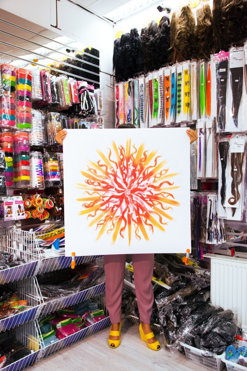
The image I present for New Window, 42 x 1€, is the latest installment in an ongoing project inspired by bargain stores. One euro products are dismissed as cheap trash in our rich societies. We buy them for fun and throw them away right after. Yet, one euro is more than a day’s wage in many parts of the world. We forget that sometimes. It takes a lot of time and care to manufacture an object. For a euro, you can own something that’s been envisioned, sketched, designed, assembled, shipped, packaged, and arranged.
Unfortunately, we might not be able to improve working conditions in Chinese factories, but at least we can appreciate their work and effort. In that sense my 42 x 1€ is a mild form of political activism. I'm not being cynical. I genuinely try to give back a certain dignity and respect to these bargain products by showing them in a new light. At the same time it is an exercise in proving that one can create with simple means.
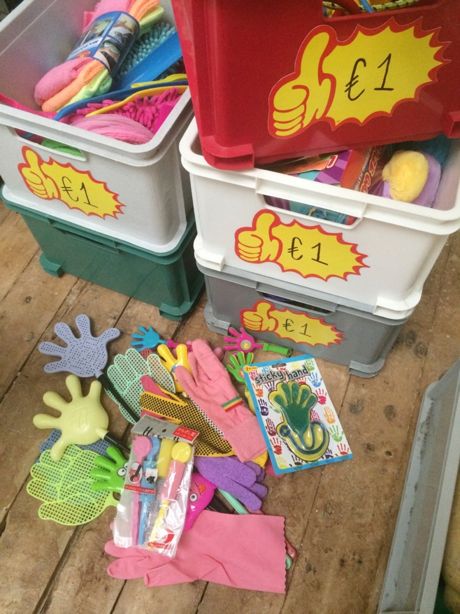
A glimpse of Simon's 1€ collection. Once in a while he digs in it and a spontaneous solution appears.
What are your inspirations—and more specifically—what inspired your 42 x €1 project?
My inspirations are broad. There are so many people making great things, it’s crazy and overwhelming sometimes. But if you want a thematic list, I would say: hiphop, Jewish humor, surrealists, sex, colours, wordplay, and bande dessiné.
Since my early youth I have been immersed in the environment of bandes dessinées (comic books), also called the '9th art' in France. I believe that the simple, graphic, humorous and colourful images of for example Tintin, Spirou, Lucky Luke, and Asterix have had a huge impact on me. I love the way these works can reach both children and adults and communicate on many different levels. It is something that I try to achieve with my work as well.
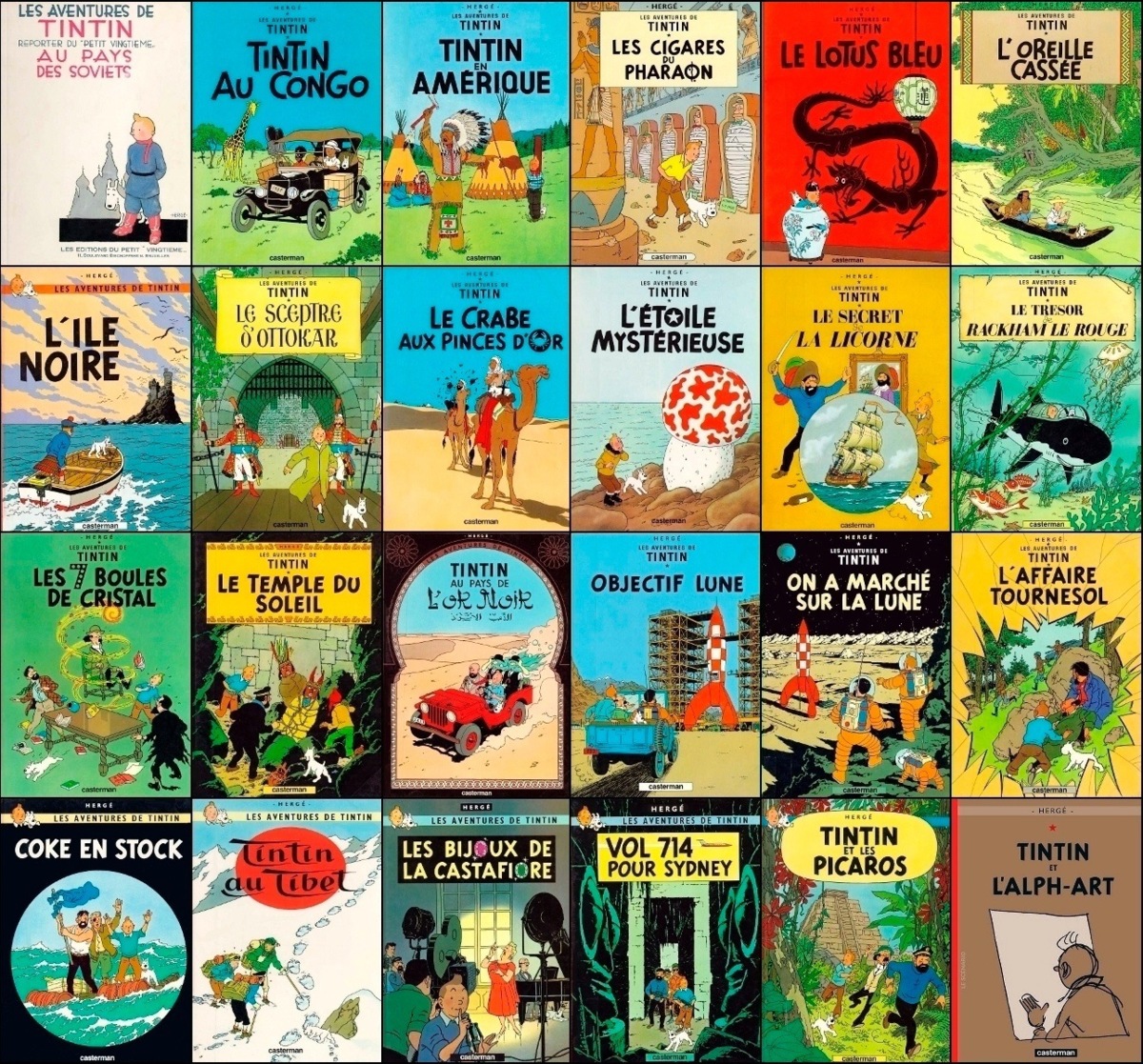
Tintin is not a very fun character, Spirou, Lucky Luke or Asterix & Obelix are much more endearing. Furthermore, Hergé's view are often old fashioned and conservative. Yet, due to his style of drawing called 'ligne claire' it's visually the comic that had the most impact on Simon.
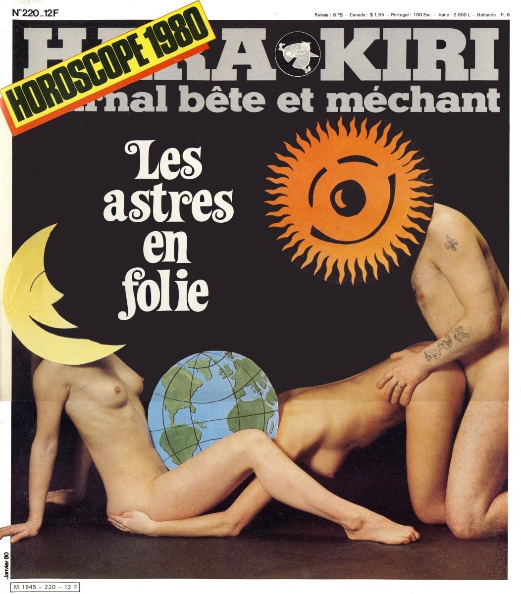
Hara-Kiri subtitled “Journal bête et méchant” (“Stupid and vicious magazine”) was a monthly French satirical magazine. It’s humour and images are very daring, bold and provocative. So much so that it was banned by the French government in the early eighties. Simon misses this crude approach in our politically correct world. "Toilet Paper Magazine is bringing a bit of that flavour back though," Simon says.
On the subject of one euro items: there are many people working with cheap materials, recycling and reappropriating them, etcetera. The reasons are not just conceptual but also purely economic. Most of the students I teach go to bargain stores to get material. I foresee a generation of “Action” store artists culminating in the recent ridiculous act of Miley Cyrus (in collaboration with Jeremy Scott) who thinks being an artist means spending 2000 dollars in a bargain store and glueing everything together.
There are almost too many artists to name who’s work is related to that field. There are some people in my direct surroundings dealing with this theme whom I find very inspiring. For instance Dirk Vis: he is currently writing a book of poetry inspired by one euro products. Bonno van Doorn is a good friend who’s spectrum is broader than the bargain world, but I love the way he creates monumental installations out of scrap material. And I have to name Erwin Wurm as one of the godfathers of cheap material installations with his one minute sculpture series.
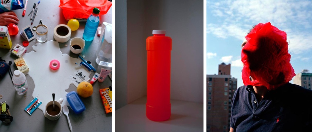
Simon: "Elspeth Diederix is a Dutch photography hero of mine. She manages to make a plastic bottle or trash bag the most poetic thing you've ever seen. Most of her oeuvre is an ode to cheap material."
(olaf-breuning-chinatown-sculptures-2007-dog.jpg)
Simon: "In a slightly more crude manner, Olaf Breuning's body of work is also an ode to bargain store gems. I find myself attracted to both the poetic approach of someone like Elspeth Diederix and the bold silly bad taste approach of someone like Olaf Breuning."
Do you devote a lot of time researching the context of your projects?
My parents are academics and I feel privileged to have inherited a broad cultural knowledge from them from an early age. They have always shared their readings and researches, which has greatly fed my general knowledge. Furthermore, like most of my peers, I am very curious and constantly soak up information. Yet when it comes to projects, I am far from a research-based artist. I’d like to think that there is more than enough input stored in our minds—input which has rarely time to get processed in our busy electronic information age lives—and that this information will get pulled out of the human database when necessary. I do not advocate ignorance, but basically, I believe that we should be able to come up with strong concepts based on our own experience and knowledge without needing endless research.
Form usually follows content in my case. The idea always proceeds. I try more and more to leave space for poetry, surprises, and discoveries during the making, rather than planning everything beforehand.
Could you walk us through that process?
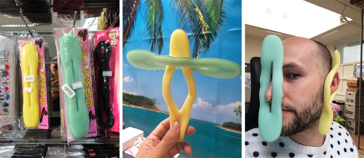
For my 42 x 1€ series I decided to work directly from the material. The process was quite intuitive and spontaneous. I visited different bargain stores in Amsterdam while letting my eye wonder on all those colourful, weird and unnecessary objects for sale.
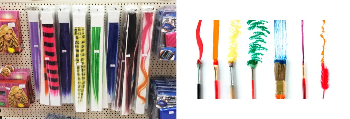
Sometimes something catches my attention, such as those hair extensions. I noticed that each hair extension had a different natural curve due to the way that it was packed. This fascinated me and I immediately got this idea to ‘paint’ with these ready-made curves, using the gradient coloured swirls as my brushes.
In a way the artistic hand is quite invisible in this project. The products are barely altered—the packaging and price tags are blatantly visible—they are merely selected and placed in a certain composition. I like this transparency, which could make people say: “I could have done this!”. It’s about the idea, not the technical prowess.
Your way of working sounds very intuitive. What kind of surprises did you encounter while working on the project?
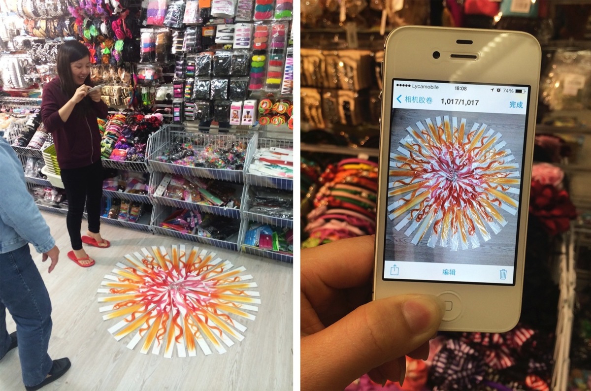
A very nice moment during this project was the interaction with the Chinese women owning the bargain store where I purchased the hair extensions. They saw me sketching straight on the floor of the store with the extensions and shouted "Beautiful!" It was great to see their enthusiasm. They asked me how I came up with the idea, they wanted to help create the shape and took snapshots on their phone. They really understood the project and the thoughts behind it.
Although my aim was to create a sun, I was happily surprise to see that the final image could be interpreted in different ways. The hole in the middle has a certain sexual connotation.
Furthermore, as much as the sun is source of life, it is also terrifying. The more I look at ‘my’ version of the sun, the more I see a menacing aspect to it too.
How do you experience your resulting work?
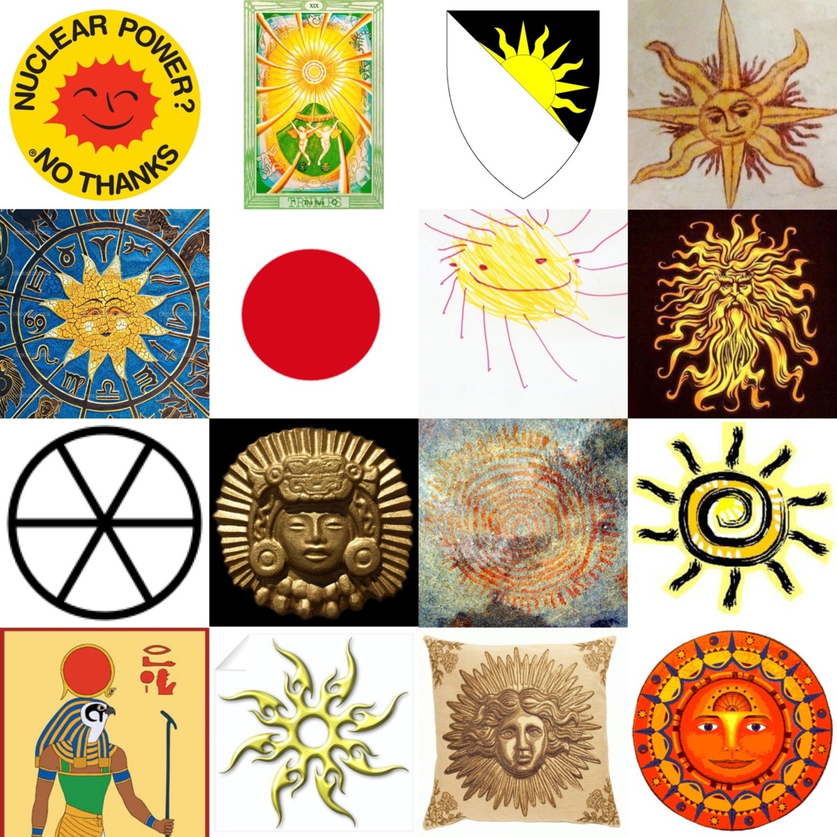
The sun is one of the most ancient symbols drawn by men. It is found in every culture and is represented in endless manners. Therefore it’s not a small task trying to deal with the depth of this subject. The sun is a visually overexploited symbol and therefore made me doubt the feasibility of my idea. The apparent simplicity of the task was intimidating. Would I be able to give a new twist to an object that one might think is already drained creatively? Was it not too pretentious and would I not burn my wings like Icarus?
However, reinterpreting clichés is a repetitive theme in my body of work, and I believe I have achieved my goal of translating the symbol of the sun in a contemporary context. Not only does it function as a decorative aesthetic piece, it also elevates a cheap throw away one euro item to an artwork, therefore questioning ideas of value, consumerism and showing that beauty can be seen in the mundane everyday details of life.
And how do you hope the viewer will experience the work?
Living in a grey and cold country for most of the year I take a great pleasure in entering my house decorated with warm sunny orange and yellow tints. I hope that when people come home to see the print on their wall they will feel welcome and smile.

